Agency Revolution
Overview
Agency Revolution is a SaaS company that provides marketing automation, website technology, and communication tools specifically designed for independent insurance agencies. The platform enables agencies to manage marketing campaigns, automate client communication, and grow their business through digital engagement.
As part of a broader overhaul of our marketing strategy, the AR’s website required a full rebrand and structural redesign. The existing experience did not reflect the company’s identity or product ecosystem and made it difficult for users to quickly access support, resources, and product information.
I led the initiative from a marketing operations perspective, shaping the new brand direction, navigation structure, and user experience to better serve both existing customers and prospective agencies evaluating the platform.
The Challenge
The website experience struggled to support the company’s evolving role as a full marketing platform for insurance agencies with three primary issues emerging—brand evolvement, dual audience needs, and navigation complexity.
The Goal
Redesign the website with modern branding and design while optimizing content and usability around the full customer lifecycle—from discovery and education to product usage and ongoing support.
Project
Agency Revolution
Brand & Website Redesign
My Role
UI/UX Design, Web Design, Deployment
Tools
Figma · Adobe Creative Suite · WordPress · HTML · CSS
Problem & Approach
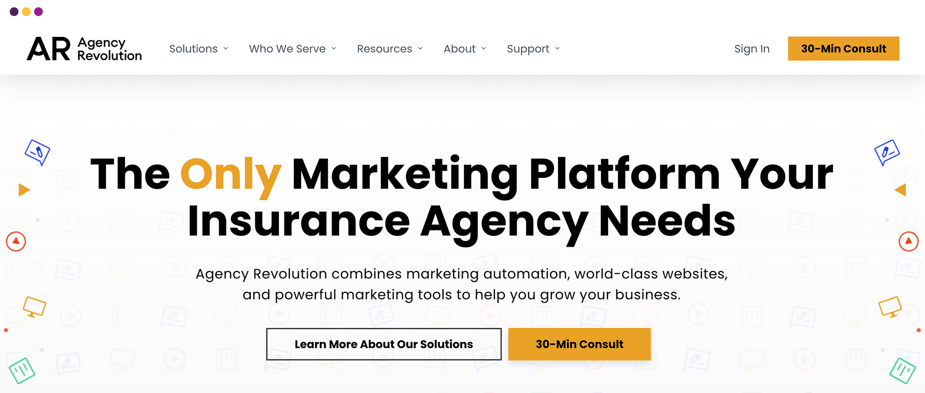
The redesign of the Agency Revolution website focused on restructuring the experience to better support a growing product ecosystem and two distinct user groups: prospective agencies and existing clients. Rather than treating it as a visual refresh, the approach centered on aligning the website with how users engage with it.
The experience was redesigned around two primary journeys—helping prospects quickly understand the platform products and enabling existing clients to access support, tools, and services without friction. To support this, the site’s information architecture was reorganized into clear content pillars, including products, resources, support, and company, making navigation more intuitive.
At the same time, the visual system was expanded to create a more human and engaging SaaS experience. The result is a site that balances professionalism with approachability while functioning as both a marketing engine and a central hub for client interaction.
Research & Insight
Several core insights guided the redesign:
- Users prioritize speed and clarity when navigating to support or tools.
- Prospective customers need a clear, simplified understanding of the platform early in their journey.
- Educational content plays a critical role in attracting and engaging new users.
- Navigation structure has a direct impact on both usability and conversion.
These insights led to a shift in approach—from designing individual pages to restructuring the entire experience around user intent.
Design Decisions
The UX Strategy
Create a website with clear pathways for products, resources, and support with simplified navigation. Include design decisions focused on reducing friction and introducing a more human, approachable SaaS experience.
Expanded Brand System
The redesign introduced additional elements that allowed the brand to become more dynamic and expressive while maintaining consistency.
Resource-Driven Content Hub
A dedicated resource hub delivers marketing strategies and guides, reinforcing the brand’s role as a go-to industry expert.
Integrated Product Storytelling
The website highlights a unified platform ecosystem designed to improve client communication, streamline operations, and fuel agency growth.
Client-Focused Support Access
Reduced friction and positioned the website as an extension of the product, simplifying access to support and resources.

Project Outcome
The redesigned website delivered a more cohesive brand experience while improving usability for both audiences. Key improvements included:
- A clearer brand identity that reflects a human, approachable SaaS company.
- Simplified navigation that helps users find what they need quickly.
- A stronger content ecosystem that supports lead generation.
- A more efficient experience for existing customers seeking support or product information.
Most importantly, the site now behaves like a modern SaaS platform hub—balancing marketing, product education, and customer support within a single experience.


The Result
This project reinforced an important reality—the best SaaS marketing websites are not just marketing sites. They are product hubs, support portals, and educational resources simultaneously.
By focusing on navigation clarity, audience segmentation, and brand personality, the resulting redesign transformed from a simple promotional website into one that supports the entire customer lifecycle.