
Blixtlan
Landing Page
Overview
Blixtlan is a business lending company operating in the high-trust financial space. Following a recent logo and brand refresh, the company needed a landing page that better supported conversion—specifically, encouraging users to begin and complete a loan application.
The Challenge
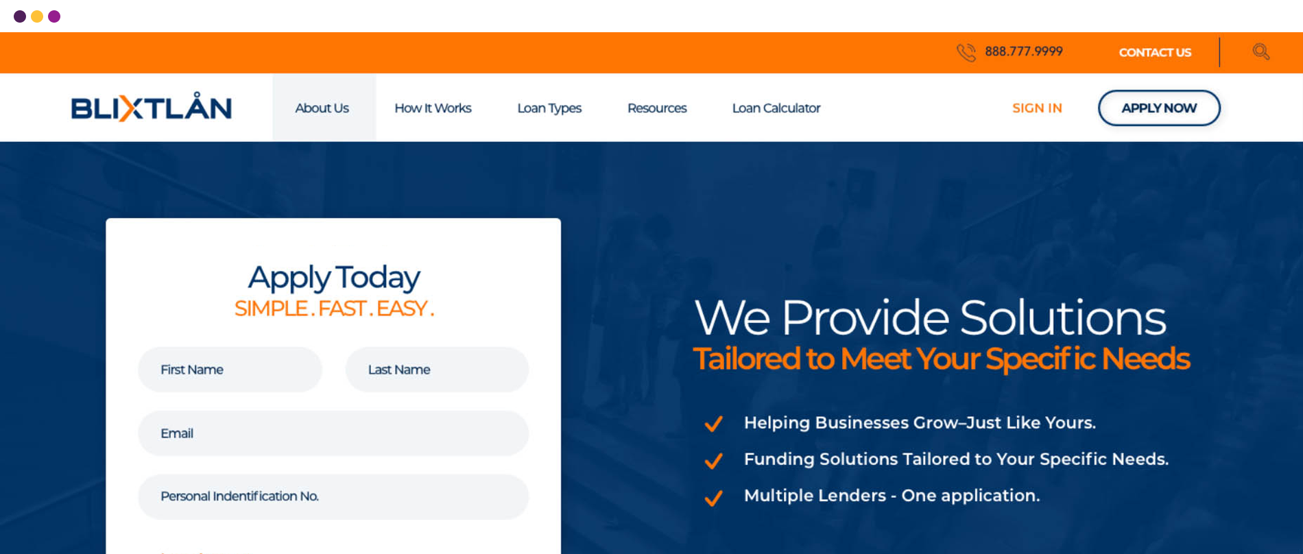
Blixtlan’s existing landing page suffered from dated visuals and information overload, leading to low conversion rates. Although users started the application with clear intent, many abandoned the process before completion.
The Goal
The Blixtlan landing page requires a conversion-first UX redesign that prioritizes the sign-up form, simplifies content for clarity, and aligns the interface with Blixtlan’s updated brand identity.
Project
Blixtlan Landing Page
My Role
UI/UX Design, Graphic Design
Tools
Sketch · Photoshop
Problem & Approach
Users arrived on the Blixtlan landing page with clear intent, but competing information made it difficult to quickly understand the offering, establish trust, or know what to do next. At the same time, the business goal of driving applications was weakened by a layout where the sign-up form did not lead the experience.
To address both user and business needs, the landing page will serve as a guided conversion system refocusing the page around the sign-up flow, reducing competing content, and aligning the layout to support faster comprehension and action.
Research & Insight
Relied on comparative analysis over user research. Key observations:
- Financial landing pages that convert well answer core questions immediately and visually.
- Strong performers treat forms as guided interactions, not secondary elements.
- Users expect clarity and reassurance before committing personal or business information.
Design Decisions
The UX Strategy
Shift from an informational layout to a conversion-led experience by elevating the sign-up form, simplifying content, and guiding users through a clear decision path.
Content
Simplification
Removing or condensing secondary content to reduce cognitive load.
Conversion-First
Layout
Elevating the sign-up form above the fold and treating it as the core interaction.
Information
Prioritization
Structuring content to support decision-making rather than explanation.
Brand
Alignment
Updating visual language to reflect Blixtlan’s modernized identity and reinforce trust.

Project Outcome
A streamlined landing page that communicates value instantly, builds trust, and directs users toward application with minimal friction. Including:
- Above-the-fold sign-up form with clear CTA.
- Modular sections that guide users from intent to action.
- Loan type breakdowns designed for quick comparison.
- Clean footer structure reinforcing trust and support access.


The Result
The final design delivered a modern, conversion-driven landing page optimized for speed, trust, and ease of use. The experience supports both first-time visitors who need quick clarity and returning users who want to act immediately. By prioritizing user intent over content volume, the page shifts from explaining the product to enabling action—allowing the interface to behave as a financial product should: confident, efficient, and easy to use.