
Borger Federal
Credit Union
Overview
Borger Federal Credit Union (BFCU) is a community-based, membership-driven financial institution. Its website serves as a primary access point for members seeking account information, services, and clarity around membership benefits.
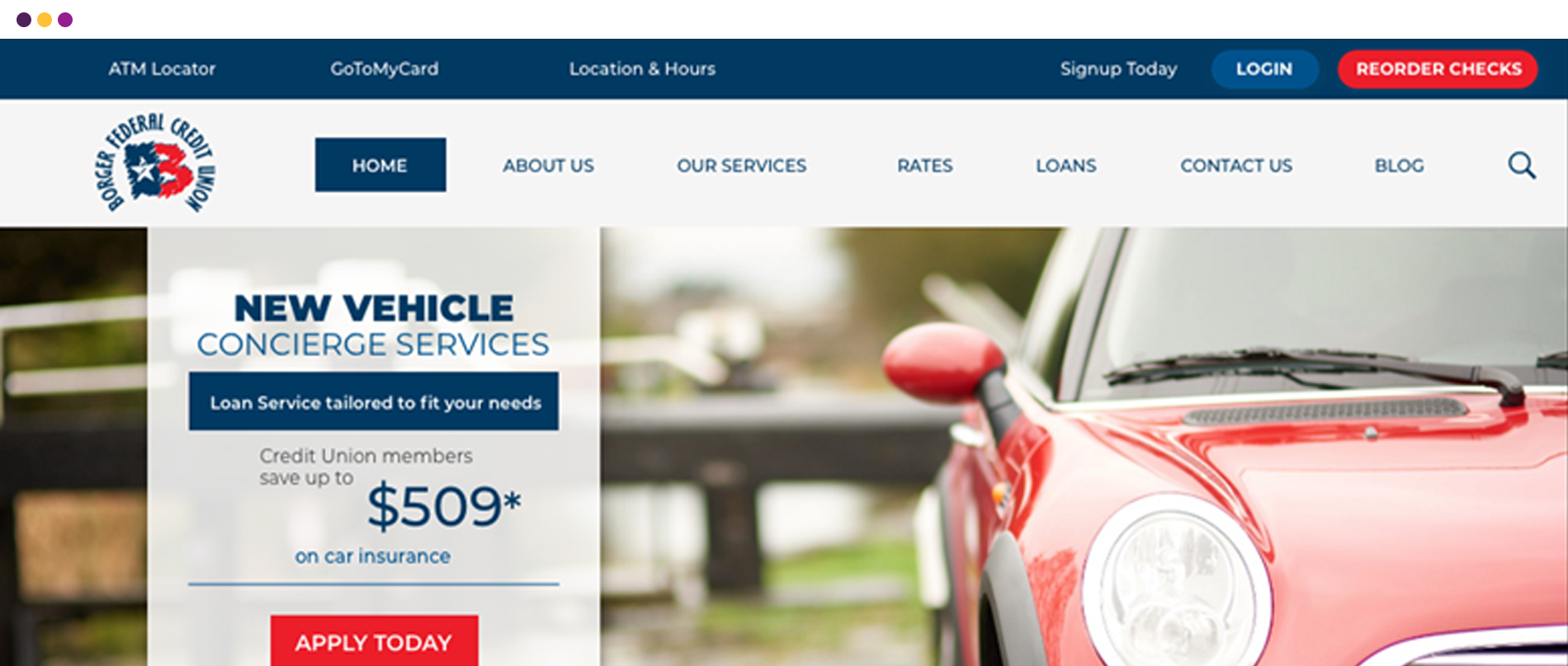
The existing homepage was visually dated and structurally cluttered, making it difficult for users to quickly find commonly sought information or understand the value of membership.
The Challenge
Key member resources were buried, content competed for attention, and the homepage lacked a clear hierarchy—creating friction in a space where trust, clarity, and efficiency are essential.
The Goal
Redesign the homepage to prioritize member needs, improve information access, and clearly communicate BFCU’s membership benefits—while maintaining the approachable, community-focused tone of the brand.
Project
BFCU Homepage Redesign
My Role
UI/UX Design, Graphic Design
Tools
Sketch · Photoshop
Problem & Approach
Credit union users typically arrive with high intent. They want to log in, find rates, understand services, or confirm eligibility—quickly and without confusion. The existing BFCU homepage asked users to work too hard to locate this information.
From a UX standpoint, the problem was not a lack of content, but a lack of structure. Important information existed, but it wasn’t organized around how members actually use the site.
The approach focused on consolidation and prioritization. Rather than introducing new content, the redesign reshaped the homepage around the most frequently accessed information and clarified how BFCU serves its members.
Research & Insight
This project relied on heuristic evaluation and pattern analysis of community credit union websites. Key insights included:
- Financial institution homepages should emphasize utility over storytelling.
- Members expect fast access to core actions and information.
- Clear articulation of membership benefits builds confidence and reinforces value.
These insights guided a design approach centered on clarity, efficiency, and trust.
Design Decisions
The UX Strategy
Simplify and restructure the homepage to support quick comprehension and easy access to high-value information. Designs were created using Sketch and Photoshop, with emphasis on layout clarity and usability rather than decorative changes.
Content
Simplification
Reducing visual noise by grouping related information and removing redundancy.
Membership
Clarity
Clearly communicating benefits and eligibility to reinforce BFCU’s value proposition.
Information
Prioritization
Elevating the most sought-after resources to prominent positions on the page.
Brand
Refinement
Updating layout and visual structure while respecting the institution’s community-focused tone.
Project Outcome
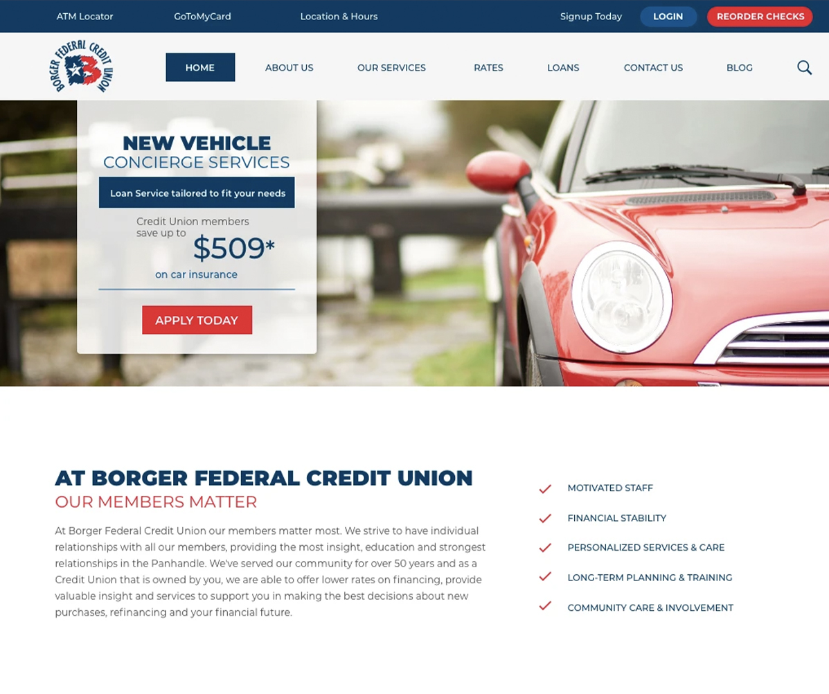
The redesigned homepage delivers:
- Faster access to key member information.
- A clearer understanding of BFCU’s services and membership benefits.
- A more approachable, organized experience aligned with user intent.
By focusing on usability and structure, the homepage now better supports both existing members and prospective ones.


The Result
The updated BFCU homepage provides a clearer, more efficient entry point into the credit union’s digital experience. Users can quickly identify relevant information without navigating unnecessary complexity, reinforcing trust in a high-stakes financial environment.
By prioritizing clarity and access over content volume, the interface behaves the way a community credit union website should—dependable, straightforward, and member-first.